
KUOW Website
OVERVIEWKUOW Public Radio is an NPR member station and the Puget Sound region’s number one radio station for news. Their mission is to create and serve a more informed public through its vision of broadening conversations and deepening understanding based on the foundation of trust.
ROLEUX/UI Designer
Wireframes, Interaction, Visual Design, Prototyping & Testing
Background
Digesting the news has changed over the past 30 years and how it’s presented to users varies across platforms. To reflect their younger audience’s demographic, KUOW took on the project of redesigning their suite of digital products.
As part of the redesign, the website would need to take on a new look, voice and tone along with any additional goals set by the client.
Goals
The website’s goals and needs were divided into four sections:
1
Business Goals
This area focuses on how to convert listeners to sustaining members and increase corporate support through advertising and grants.
2
Integrations
We needed to be able to ensure all output sources were accounted for and any current sources were easily migrated.
3
Reader Facing
One major goal was to grow the audience as well as enhance the engagement with them, all while being the concierge of public content.
4
KUOW Facing
For KUOW the new website needed to be simple and easy to use. Checks and balances were improved and reporting was easily digestable.
Page Templates & Wireframing
Before we could start wireframing, we needed to define the templates of the public facing website pages that will be used throughout the site.
In-built pages: Custom designed elements built into the site’s architecture that may not be directly editable via the CMS, or would have limited editing functionality
Ad-hoc pages: These are the pages that would have static content, for instance, and About page.
Aggregate pages: Content on these pages would be dynamically chosen by the site admin. These pages are sourced from content like ‘stories’, ‘taxonomies’, ‘podcasts’ and ‘staff.’ A great example of an aggregate page in this project is the Home page.
Taxonomy pages: These pages are quite similar to the aggregate pages, with the difference being the source feed. These pages would be driven from ‘topics’, ‘tags’ and ‘collections.’
Story Detail pages: As you may have guessed it, this template houses the content for each story. There were varying types of detail pages that the admin could display. We provided them with the ability to display short-form, long-form, photo galleries and live blog pages.
Podcast pages: Each podcast had its own dedicated landing page where metadata and content about the podcast were housed. Episodes and any other marketing material were featured to help engagement were also displayed.
Episode pages: Each episode within the podcast was given a landing page. This housed the accompanying story and imagery (if applicable).
Author Pages: Dynamically curated for the staff members who have stories attributed to them. There are two categories that they could fall under.
Featured (KUOW) Authors: Includes an expanded bio that consists of an image, title and list of attributed stories.
Feed (NPR) Authors: This is a simpler template which houses only a list of attributed stories.
Below are a few examples of the wireframes. Wireframes were fairly high-fidelity to help convey to the client the type of content that was to be placed on each page.
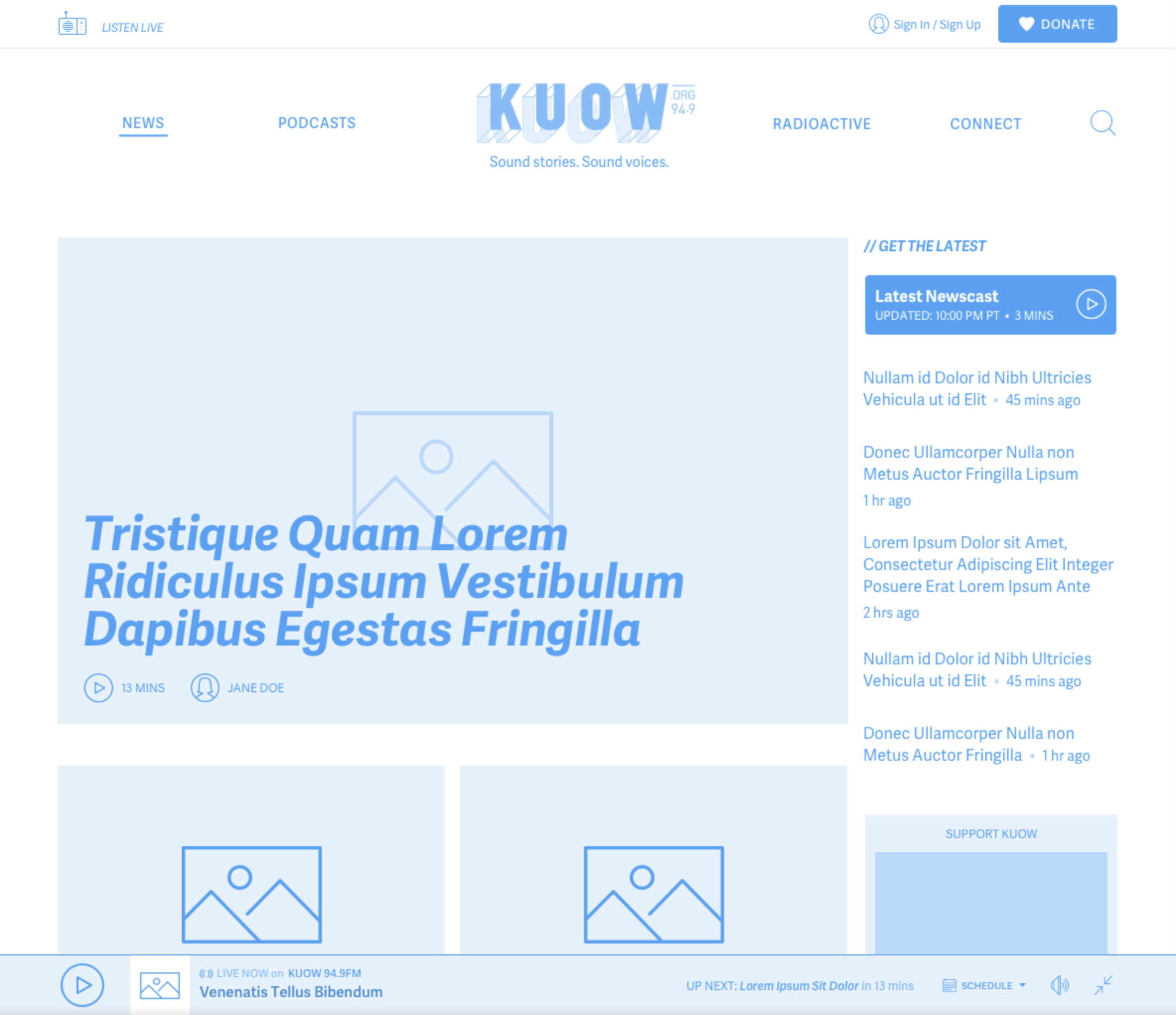
Aggregate Page Template

Podcast Episode Detail Page Template

Ad-Hoc Page Template
Global Media Player
The global media player was positioned at the bottom of the user’s viewport—fixed. This allowed it to be easily accessible and drive further interaction with the content.
There were multiple states accounted for depending on what the user was listening to, how strong of an internet connection they had and their preference as to using the default size player or the minimized version.

The player also enclosed the schedule. If selected, a drawer would open from the bottom of the viewport and would reveal Today’s Schedule. The user was given two more options relating to the schedule: view the week’s schedule or download the monthly schedule.

If users created an account, they were given additional features that allowed them to maintain a queue, manage favorites as well as see their history.
Solution
With the goals and needs in mind, we made sure this image-centric website design encouraged visitors to engage with KUOW, grows the audience by decreasing barriers and increasing usability, convert visitors into sustaining members via the easy-to-use and informative donation platform, and increase advertising opportunities within the site by seamlessly integrating them within the content of the page.
The client was very pleased with the outcome and there were some outstanding results that came from it.
Increase Engagement/Time Spent Reading Articles
7:11 minutes (After redesign)
vs
3:34 minutes (Before redesign)
Lower Bounce Rate
7.49% (After redesign)
vs
70.13% (Before redesign)
Increased Use of Global Player
800k (After redesign)
vs
70k (Before redesign)


